So I had this question when writing for this blog. How to center align images on mobile displays with CSS. All my posts with aligned pictures to the right looked bad when I was browsing them on my mobile.
This is a problem because the latest statistics indicate that approximately 50.88% of all users use a mobile device when browsing the web. The trend is going upwards so it’s important that your web page works and looks good on a smaller screen.
After around 1hour of testing, it now works perfectly and the images are center-aligned on mobile displays. This article also goes over some additional tips to further enhance the responsiveness of our web pages.
CSS Align Image Center
Edit the CSS in the template customization. Dashboard/Appearance/Customize/Additional CSS. Add the following code: @media screen and (max-width: 599px) { #page .alignleft, #page .alignright { float: none; display: block; margin-left: auto; margin-right: auto; }}
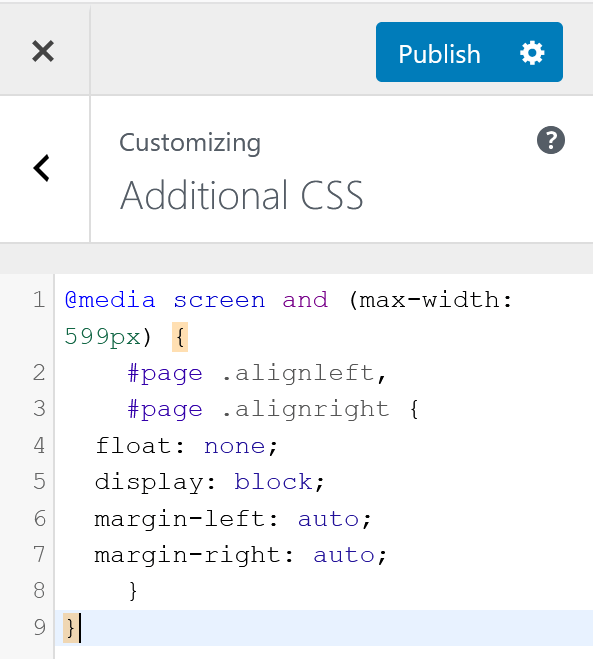
@media screen and (max-width: 599px) {
#page .alignleft,
#page .alignright {
float: none;
display: block;
margin-left: auto;
margin-right: auto;
}
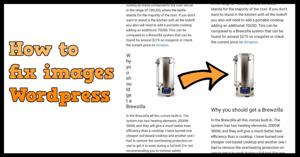
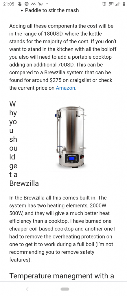
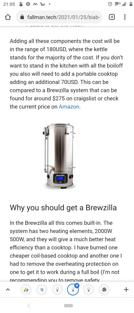
}The code will be active if your screen resolution is below 599 pixels, like mobile displays. The result will be that images and pictures that are aligned left or right will be center in line between the text blocks. See the difference in the two pictures below.
These changes made a huge impact on my web pages and will help with the readability for mobile user. This is how to do css align image center.
Additional Responsive Styling for Improved Mobile Experience
In the quest for a seamless mobile browsing experience, aligning images properly becomes a crucial aspect of web design. In the previously discussed method of center-aligning images on mobile displays using CSS, we can further enhance the responsiveness of our web pages by addressing additional styling considerations.
1. Adjusting Image Size for Mobile Devices
While center-aligning images, it’s often beneficial to optimize their size for smaller screens. This ensures that images not only appear centered but also maintain a balanced and visually appealing proportion. To achieve this, consider adding the following code within the same media query:
@media screen and (max-width: 599px) { #page img { max-width: 100%; height: auto; } }This snippet ensures that images within the specified screen width do not exceed the width of their container, promoting a more harmonious layout.
2. Improved Padding for Readability
In some cases, additional spacing around images can significantly enhance the overall readability on mobile devices. By adjusting the padding within the media query, you can create a more visually pleasing separation between images and surrounding text:
@media screen and (max-width: 599px) { #page .alignleft, #page .alignright { padding: 10px; /* Adjust the padding according to your design preferences */ } }Experiment with the padding value to find the optimal balance for your specific design and content.
3. Ensuring Consistent Styling Across Devices
To maintain a cohesive design across various devices, it’s crucial to address any potential discrepancies in styling. Extend the media query to encompass broader screen resolutions, ensuring a smooth transition between different devices:
@media screen and (max-width: 1024px) { #page .alignleft, #page .alignright { float: none; display: block; margin-left: auto; margin-right: auto; padding: 10px; /* Adjust the padding as needed */ } #page img { max-width: 100%; height: auto; } }By expanding the media query to include a wider range of screen sizes, you ensure that your center-aligning technique remains effective across a spectrum of devices, from smaller smartphones to larger tablets.
Implementing these additional adjustments will contribute to a more polished and user-friendly mobile experience, accommodating the diverse preferences and screen sizes of your audience.